 |   |
Enhanced LCDUI
MIDP 2 adds quite a bit of functionality to the LCDUI, including support for custom items, better form layout, spacer items, changes to ChoiceGroup and List controls, commands on items, and tons of cool new things with graphics. In this section you'll explore in detail how all of these new features work.
CustomItem
MIDP 2 features a new CustomItem class, which lets you code your own LCDUI items and insert them into forms just like regular itemsa bit like a Windows custom control. What the item does, including how it's drawn and reacts to input, is up to you. This is great for games in which you want to spruce up the UI a little, but you don't want to go as far as writing a complete interface.
To create your own item, derive a new class from CustomItem and fill in the abstract methods. Following is a simple example that creates a red item with severe emotional problemsit changes from happy to sad at the press of a key.
import javax.microedition.lcdui.*;
The first thing to notice is this class extends the new MIDP 2 CustomItem.Most of the work is done in the paint method.
public class SmileyItem extends CustomItem
{
    // the state of the item; true for happy, false for sad
    private boolean isHappy;

    public SmileyItem(String title)
    {
        super(title);
        isHappy = true;
    }

    public void change()
    {
        isHappy = !isHappy;
        repaint();
    }

    // overide abstract methods to fill in size details for the item
    public int getMinContentWidth()             { return 50; }
    public int getMinContentHeight()             { return 20; }
    public int getPrefContentWidth(int width)   { return getMinContentWidth(); }
    public int getPrefContentHeight(int height) { return getMinContentHeight(); }
The paint method is where we implement the custom rendering for this new item. You can do just about anything you want in here to make your own UI items.
// We're responsible for drawing the item onto a supplied graphics canvas
// for our custom smiley we just draw a red box and some text.
public void paint(Graphics g, int w, int h)
{
    // set color to red
    g.setColor(0xff0000);

    // fill the item area
    g.fillRect(0, 0, w - 1, h - 1);
    // change to white
    g.setColor(0xffffff);

    // set the font
    g.setFont(Font.getDefaultFont());

    // draw the smiley using text
    g.drawString(":" + (isHappy ? ")" : "("), getMinContentWidth()/2, 1,
                   Graphics.TOP | Graphics.HCENTER);
}
With a custom item we have to handle all the input ourselves, in this case we just change the state of the smiley no matter what they hit.
    protected void keyPressed(int keyCode)
    {
        change();
    }
}
import javax.microedition.lcdui.*;
import javax.microedition.midlet.*;
This class is a simple MIDlet to load up the custom item setup in the previous class.
public class CustomItemExample extends MIDlet implements CommandListener
{
    private Form form;
    public CustomItemExample()
    {
        form = new Form("A Custom Item");
This is where you add the new SmileyItem just like a regular Item object. In this way all the details of handling in the interface are taken care of for you.
    form.append(new SmileyItem("Smile"));
    form.addCommand(new Command("Exit", Command.EXIT, 0));
    form.setCommandListener(this);
}

public void startApp()
{
    Display.getDisplay(this).setCurrent(form);
}

public void pauseApp()
    {
    }

    public void destroyApp(boolean unconditional)
    {
    }

    public void commandAction(Command c, Displayable s)
    {
        if (c.getCommandType() == Command.EXIT)
            notifyDestroyed();
    }
}
NOTE
Tip
If you attempt to compile this class against MIDP 1 class files, you will get errors relating unimplemented abstract methods such as getHeight and isFocusable. If this happens, double-check that you are compiling against the MIDP 2 midpapi.zip JAR.You might need to carefully check the class path set in your IDE.
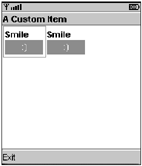
Figure 19.3 shows how this looks when running in the MIDP 2 default emulator.
Figure 19.3. An example of a custom item that draws a white smiley face on a red rectangle
Custom items can be really cool if you spend some time on them. Adding a steering wheel control to change values in a racing game, a rolling menu system with animation, or even just flashy text-entry boxes can all enhance the look and feel of your game. You can develop a control to do almost anything you want, and then have the convenience of simply adding it into a Form as you would any other Item.
Form Control
Forms in MIDP 2 have some extra features as well. First, you can now choose a layout policy for items within a form. The device implementation uses these layout directives to alter the size and position of items for the best effect.
You can apply any of the layout directories listed in Table 19.1 to an item and see the effects. The exact layout and position, however, are up to the device, so you can't rely on an item appearing with the same position or size on all devices.
|
Layout Directive |
Description |
|---|---|
|
LAYOUT_DEFAULT |
Default layout (leave it up to the implementation) |
|
LAYOUT_LEFT |
Align the item to the left |
|
LAYOUT_RIGHT |
Align the item to the right |
|
LAYOUT_CENTER |
Center the item |
|
LAYOUT_TOP |
Align to the top |
|
LAYOUT_BOTTOM |
Align to the bottom |
|
LAYOUT_VCENTER |
Vertically center the item |
|
LAYOUT_NEWLINE_BEFORE |
This item will start on a new line |
|
LAYOUT_NEWLINE_AFTER |
This item will be the last one on a line (with a new line starting immediately after this item) |
|
LAYOUT_SHRINK |
Allow this item to shrink to the minimum width if required |
|
LAYOUT_VSHRINK |
Allow this item to shrink to the minimum height if required |
|
LAYOUT_EXPAND |
Expand the item as wide as possible |
|
LAYOUT_VEXPAND |
Expand the item as high as possible |
|
LAYOUT_2 |
Indicate that MIDP 2 layout is in effect for this item |
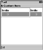
Figure 19.4 shows an example MIDlet with two custom smiley items added to a form. In this case the device lays out the two items with equal space.
Figure 19.4. Two items added to a form with no layout options set
If you now set the LAYOUT_EXPAND directive on the first item, you can see in Figure 19.5 how the implementation increases the width of the item up to the maximum available space (leaving the minimum room for the second item).
Figure 19.5. The first smiley item has the LAYOUT_EXPAND set, causing it to assume the majority of screen space (see FormLayoutExample).
import javax.microedition.lcdui.*;
import javax.microedition.midlet.*;

public class FormLayoutExample extends MIDlet implements CommandListener
{
    private Form form;

    public FormLayoutExample()
    {
        form = new Form("Layout Example");

        SmileyItem s1 = new SmileyItem("Smile");
This is the primary difference between this and the previous example. Here a new custom item is given a layout directive to expand across the screen. A second item added below does have this directive. From Figure 19.5 you can see how the first one expands to fill the remaining space on the layout line.
    // set the layout to expand this item as much as possible,
    // also indicate we are using MIDP 2 layout styles
    s1.setLayout(Item.LAYOUT_EXPAND | Item.LAYOUT_2);

    form.append(s1);

    SmileyItem s2 = new SmileyItem("Smile");
    form.append(s2);
    form.addCommand(new Command("Exit", Command.EXIT, 0));
    form.setCommandListener(this);
}

public void startApp()
{
    Display.getDisplay(this).setCurrent(form);
}

public void pauseApp()
{
}

public void destroyApp(boolean unconditional)
{
}
    public void commandAction(Command c, Displayable s)
    {
        if (c.getCommandType() == Command.EXIT)
            notifyDestroyed();
    }
}
Spacer Item
Now that you have more control over the layout of objects, you'll quickly find cases where you want to add space between items to organize the layout. MIDP 2 provides the Spacer class to let you do this.
Using a spacer is dead easy; simply construct it with the minimum horizontal and vertical space you need and then add it to the form as you would any other item. You can then use layout commands on the spacer to further control placement.
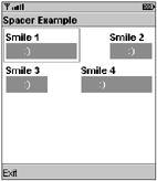
In the following example I've expanded the smiley arrangement to have two rows containing two smileys separated by a spacer.You can see the results in Figure 19.6.
Figure 19.6. Smileys separated using spacer items
import javax.microedition.lcdui.*;
import javax.microedition.midlet.*;

public class SpacerExample extends MIDlet implements CommandListener
{
    private Form form;

    public SpacerExample()
    {
        form = new Form("Spacer Example");

        // ROW 1 -----------------
        SmileyItem s1 = new SmileyItem("Smile 1");
        s1.setLayout(Item.LAYOUT_EXPAND | Item.LAYOUT_2);
        form.append(s1);

        // add a spacer in between the two smileys on the first row
        form.append(new Spacer(30, 30));
        // add the second smiley
        form.append(new SmileyItem("Smile 2"));

        // ROW 2 ---------
        form.append(new SmileyItem("Smile 3"));

        // add a spacer in between the two smileys on the second row
        form.append(new Spacer(30, 30));

        SmileyItem s4 = new SmileyItem("Smile 4");

        // expand the second smiley (expanding)
        s4.setLayout(Item.LAYOUT_EXPAND | Item.LAYOUT_2);
        form.append(s4);

        form.addCommand(new Command("Exit", Command.EXIT, 0));
        form.setCommandListener(this);
    }

    public void startApp()
    {

        Display.getDisplay(this).setCurrent(form);
    }

    public void pauseApp()
    {
    }

    public void destroyApp(boolean unconditional)
    {
    }

    public void commandAction(Command c, Displayable s)
    {
        if (c.getCommandType() == Command.EXIT)
            notifyDestroyed();
    }
}
Due to their nature, spacer items cannot have commands, and you cannot navigate to them.
ChoiceGroup and List
The ChoiceGroup and List items also gain some new features in MIDP 2. First, you can now set a font for them to use. This adds some flexibility to how you want ChoiceGroups and Lists to appear; however, this is only a recommendation, and it doesn't work practically for all choice types (notably POPUPs).
The ChoiceGroup has a new POPUP type, which is something like a Windows drop-down menu. The GUI will display a single item picked from a list that drops down when you select the item. It's up to the implementation to draw how this control works, but most of the time you'll see a field with a down arrow indicating that more options are available.
Now you can also set a fit policy to indicate whether or not you want items in a list to wrap.
NOTE
Note
ChoiceGroup and List now also have a deleteAll method to remove all the elements of a list in one go.
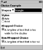
You can see all these features in action in Figure 19.7 and in the following code.
Figure 19.7. A demonstration MIDlet showing a drop-down style ChoiceGroupa list containing items using different fonts, as well as two choices using different fit policies
import javax.microedition.lcdui.*;
import javax.microedition.midlet.*;

public class ChoiceExample extends MIDlet implements Comman-
dListener
{
    private Form form;

    public ChoiceExample()
    {
        form = new Form("Choice Example");

        // a simple example of a popup list containing the
names of shapes
        ChoiceGroup c = new ChoiceGroup("Shapes", Choice.POPUP);
        c.append("Triangle", null);
        c.append("Square", null);
        c.append("Circle", null);
        form.append(c);

        // create an exclusive style choice with items representing different
    // fonts, then we set that style.
    ChoiceGroup c2 = new ChoiceGroup("Styles", Choice.EXCLUSIVE);
    c2.append("Italic", null);
    c2.append("Bold", null);
    c2.setFont(0, Font.getFont(Font.FACE_PROPORTIONAL, Font.STYLE_ITALIC,
                               Font.SIZE_SMALL));
    c2.setFont(1, Font.getFont(Font.FACE_PROPORTIONAL, Font.STYLE_BOLD,
                               Font.SIZE_SMALL));
    form.append(c2);

    // a wide list with wrapping on
    ChoiceGroup c3 = new ChoiceGroup("Wrapped Choice", Choice.EXCLUSIVE);
    c3.append("A long line of text that is too wide for the display", null);
    c3.setFitPolicy(Choice.TEXT_WRAP_ON);
    form.append(c3);

    // a wide list with wrapping off
    ChoiceGroup c4 = new ChoiceGroup("Non-Wrapped Choice", Choice.EXCLUSIVE);
    c4.append("A long line of text that is too wide for the display", null);
    c4.setFitPolicy(Choice.TEXT_WRAP_OFF);
    form.append(c4);

    form.addCommand(new Command("Exit", Command.EXIT, 0));
    form.setCommandListener(this);
}

public void startApp()
{
    Display.getDisplay(this).setCurrent(form);
}

public void pauseApp()
{
}

public void destroyApp(boolean unconditional)
{
}

public void commandAction(Command c, Displayable s)
{
        if (c.getCommandType() == Command.EXIT)
            notifyDestroyed();
    }

}
Item Commands
Now you can associate a Command with an Item.(In MIDP 1, Commands could only be added to a Form.) The MID will present commands associated with a particular item whenever it has focus (selected by the user).
To create an Item command, you simply construct a Command as normal and then use the new Item.addCommand method to associate it. To carry out actions when the Command is entered, use the Item.setItemCommandListener method.
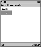
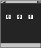
In the following example, you can see a change Command added to your friend the SmileyItem.See Figure 19.8 for the results.
Figure 19.8. An example of an item command; note that the "change" command is only displayed when the smiley item is focused.
import javax.microedition.lcdui.*;
import javax.microedition.midlet.*;
public class ItemCommandExample extends MIDlet implements
        CommandListener, ItemCommandListener
{
    private Form form;
    private SmileyItem smiley;
    private Command changeEmotion;
    public ItemCommandExample()
    {
        form = new Form("Item Commands");

        // create a smiley item
        smiley = new SmileyItem("Smile");

        // create a command to change the type and add it as a command
        // onto the smiley item.
        changeEmotion = new Command("Change", Command.ITEM, 1);
        smiley.addCommand(changeEmotion);

        // set this class to be the listener for the command
        smiley.setItemCommandListener(this);

        form.append(smiley);
        form.addCommand(new Command("Exit", Command.EXIT, 0));
        form.setCommandListener(this);
    }

    public void startApp()
    {
        Display.getDisplay(this).setCurrent(form);
    }

    public void pauseApp()
    {
    }

    public void destroyApp(boolean unconditional)
    {
    }

    // form command listener
    public void commandAction(Command c, Displayable s)
    {
        if (c.getCommandType() == Command.EXIT)
            notifyDestroyed();
    }
    // item command listener
    public void commandAction(Command command, Item item)
    {
        if (command == changeEmotion)
        {
            smiley.change();
        }
    }
}
Graphics
One of the best areas of improvement for game development is in the revisions to the Graphics class. Now you can copy parts of the display using copyArea,draw triangles using fillTriangle,draw parts of an image using drawRegion, and figure out the actual color a device uses based on a particular RGB value using getDisplayColor.
If that's not enough, what's really cool is that you now have standard image rotation and reflection along with the power to directly manipulate images using RGB values. Read on to check these out in a little more detail.
Reflection and Rotation
Now you can draw a portion of an image on the screen using the new Image.drawRegion method. This is great, but the really cool thing is that this method also does reflection and rotation (similar to the Nokia UI).
Table 19.2 lists all the image manipulation options. Using these options, you can rotate or reflect an image in any 90-degree increment. Following is an example that rotates an image using every type. You can see the results in Figure 19.9.
Figure 19.9. MIDP 2's new image manipulation lets you flip an image around.
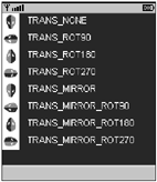
|
Manipulation Option |
Description |
|---|---|
|
Sprite.TRANS_NONE |
Copy with no alteration (default) |
|
Sprite.TRANS_ROT90 |
Rotate the image region clockwise by 90 degrees |
|
Sprite.TRANS_ROT180 |
Rotate the image region clockwise by 180 degrees |
|
Sprite.TRANS_ROT270 |
Rotate the image region clockwise by 270 degrees |
|
Sprite.TRANS_MIRROR |
Reflect the image region vertically |
|
Sprite.TRANS_MIRROR_ROT90 |
Reflect vertically and then rotate clockwise by 90 degrees |
|
Sprite.TRANS_MIRROR_ROT180 |
Reflect vertically and then rotate clockwise by 180 degrees |
|
Sprite.TRANS_MIRROR_ROT270 |
Reflect vertically and then rotate clockwise by 270 degrees |
import javax.microedition.lcdui.*;
import javax.microedition.lcdui.game.Sprite;
import javax.microedition.midlet.*;
import java.io.IOException;

public class GraphicsExample extends MIDlet
{
    private MyCanvas myCanvas;

    class MyCanvas extends Canvas
    {
        private Image alienHeadImage = null;
public MyCanvas()
{
    try
    {
        alienHeadImage = Image.createImage("/alienhead.png");
    }
    catch (IOException ioe)
    {
        System.out.println("unable to load image");
    }
}

protected void paint(Graphics g)
{
    g.setColor(0, 0, 0);
    g.fillRect(0, 0, getWidth(), getHeight());
    g.setColor(0xffffff);
    int y=0;

    // TRANS NONE
    g.drawRegion(alienHeadImage, 0, 0,
                  alienHeadImage.getWidth(), alienHeadImage.getHeight(),
                  Sprite.TRANS_NONE, 0, y, Graphics.TOP | Graphics.LEFT);
    g.drawString("TRANS_NONE", alienHeadImage.getWidth() + 10, y,
                  Graphics.TOP | Graphics.LEFT);
    y += alienHeadImage.getHeight();

        // TRANS ROT 90
    g.drawRegion(alienHeadImage, 0, 0,
                  alienHeadImage.getWidth(), alienHeadImage.getHeight(),
                  Sprite.TRANS_ROT90, 0, y, Graphics.TOP | Graphics.LEFT);
    g.drawString("TRANS_ROT90", alienHeadImage.getWidth() + 10, y,
                  Graphics.TOP | Graphics.LEFT);
    y += alienHeadImage.getHeight();

    // TRANS ROT 180
    g.drawRegion(alienHeadImage, 0, 0,
                  alienHeadImage.getWidth(), alienHeadImage.getHeight(),
                  Sprite.TRANS_ROT180, 0, y, Graphics.TOP | Graphics.LEFT);
    g.drawString("TRANS_ROT180", alienHeadImage.getWidth() + 10, y,
                  Graphics.TOP | Graphics.LEFT);
    y += alienHeadImage.getHeight();
// TRANS ROT 270
g.drawRegion(alienHeadImage, 0, 0,
             alienHeadImage.getWidth(), alienHeadImage.getHeight(),
             Sprite.TRANS_ROT270, 0, y, Graphics.TOP | Graphics.LEFT);
g.drawString("TRANS_ROT270", alienHeadImage.getWidth() + 10, y,
             Graphics.TOP | Graphics.LEFT);
y += alienHeadImage.getHeight();

// TRANS MIRROR
g.drawRegion(alienHeadImage, 0, 0,
             alienHeadImage.getWidth(), alienHeadImage.getHeight(),
             Sprite.TRANS_MIRROR, 0, y, Graphics.TOP | Graphics.LEFT);
g.drawString("TRANS_MIRROR", alienHeadImage.getWidth() + 10, y,
             Graphics.TOP | Graphics.LEFT);
y += alienHeadImage.getHeight();

// TRANS MIRROR_ROT90
g.drawRegion(alienHeadImage, 0, 0,
             alienHeadImage.getWidth(), alienHeadImage.getHeight(),
             Sprite.TRANS_MIRROR_ROT90, 0, y, Graphics.TOP | Graphics.LEFT);
g.drawString("TRANS_MIRROR_ROT90", alienHeadImage.getWidth() + 10, y,
             Graphics.TOP | Graphics.LEFT);
y += alienHeadImage.getHeight();

// TRANS MIRROR_ROT180
g.drawRegion(alienHeadImage, 0, 0,
             alienHeadImage.getWidth(), alienHeadImage.getHeight(),
             Sprite.TRANS_MIRROR_ROT180, 0, y, Graphics.TOP | Graphics.LEFT);
g.drawString("TRANS_MIRROR_ROT180", alienHeadImage.getWidth() + 10, y,
             Graphics.TOP | Graphics.LEFT);
y += alienHeadImage.getHeight();

// TRANS MIRROR_ROT270
g.drawRegion(alienHeadImage, 0, 0,
             alienHeadImage.getWidth(), alienHeadImage.getHeight(),
             Sprite.TRANS_MIRROR_ROT270, 0, y, Graphics.TOP | Graphics.LEFT);
g.drawString("TRANS_MIRROR_ROT270", alienHeadImage.getWidth() + 10, y,
             Graphics.TOP | Graphics.LEFT);
    }

}

public GraphicsExample()
    {
        myCanvas = new MyCanvas();
    }
    protected void startApp() throws MIDletStateChangeException
    {
        Display.getDisplay(this).setCurrent(myCanvas);
    }
    protected void pauseApp()
    {
    }
    protected void destroyApp(boolean unconditional) throws MIDletStateChangeException
    {
    }
}
Image Arrays
One of the great new features in MIDP 2 is that you're able to represent images as arrays of integers. This gives you the power to manipulate the values and thus carry out image processing on the fly. You can use this feature for all sorts of cool things, such as increasing or decreasing image brightness, changing image size, creating shadows effects, or simply shifting colors.
MIDP 2 represents an image as an array of 32-bit integers, where each element corresponds to a single pixel in the image. The 32 bits correspond to 8 bits for each of the red, green, and blue elements and 8 bits for the alpha channel (also known as ARGB).
To create an RGB image you first need to construct an array of integers large enough to represent all its pixels. For example, the following code creates an image array and then sets all the pixels to be semi-transparent green.
// create a 10 by 10 image array
int numPixels = 10 * 10;
int[] rgbImage = new int[numPixels];

// fill pixel array with semi-transparent green
for (int i=0; i < numPixels; i++)
    rgbImage[i] = 0x5500FF00;
To render this on the display, you use the Graphics class's new drawRGB method. This takes the image array data, array offset (where in the array the image starts; usually this is the first byte, or zero), scan length (the number of array elements per row, typically the image width), the position at which you want the image to appear, the width and height, and finally whether you want the alpha channel processed. (If you're not using the alpha channel in your image array, you can use false in order to speed up rendering.) Here's an example that draws the image array you created a moment ago onto the display:
g.drawRGB(rgbImage, 0, 10, 75, 50, 10, 10, true);
Creating images like this is useful, but the real fun begins when you start manipulating existing images to create different effects. To do this, you first need to load an image to use. For example:
Image img = Image.createImage("/image.png");You then need to construct an array large enough to hold an integer for every pixel in the image. You can get this simply by multiplying the image width by the height.
int[] rgbData = new int[(img.getWidth() * img.getHeight())];
You can now use the Image class's new getRGB method to populate the array.
// Extract the integers that make up the image into the rggData array.
img.getRGB(rgbData, 0, img.getWidth(), 0, 0, img.getWidth(),
            img.getHeight());
Now that you have all the image data in an array you can play around with it. A good way to utilize your new power is to recolor images to create different versions. In Star Assault, for example, you could create a set of enemy ships as a base and then dynamically color different versions to represent stronger enemy types. Using this method you can add much more variety to a game without adding to JAR space. Take a look at exactly how this is done using RGB images.
NOTE
Tip
If you want to create a translucent shadow effect, you can do it easily by using an RGB image. Simply create a copy of the original image and then flip all pixels (that are not already transparent) to a transparent color, such as 0x5533333 (a transparent gray). To render the shadow, draw it before you draw the main image and offset its position to give it perspective.
Now that you can access the integers that represent pixels in the image, you can now start to manipulate that image by altering the colors represented in each pixel. In the next section you'll develop code to extract the color components, and then put them back into the image.
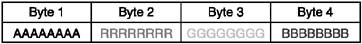
To manipulate pixels you first need to be able to split out the individual color components represented in the 32-bit integer. Each integer in the array is made up of four components, each using 8 bits (ARGB). In Figure 19.10, you can see how the four bytes represent each color.
Figure 19.10. The bits that make up the four bytes for each pixel in an RGB image
Therefore, to represent any color, you can use the hex value corresponding to each of the color components you want. For example, 0x005500FF turns on half the bits for the red component and all the bits for blue, giving you a rather attractive shade of purple. You can see this illustrated in Figure 19.11.
Figure 19.11. The bits that make up the RGB color 0x005500FF
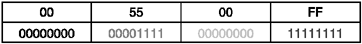
Now imagine that you want to switch all those red pixels to green ones, keeping the exact same relative shade. To do this, you first need to isolate the different color components out of the integer value using a bit-wise AND mask. The mask should turn on (set to a value of 1) the bits representing the values you're after and turn off (set to a value of 0) the elements you don't want. When you use an AND operation on the original value combined with the mask, the result contains only values where the original bit was 1 and the mask was 1. Therefore, any bit turned on in the original color will come through, but only for the segment in which you're interested. Figure 19.12 shows an example of this.
Figure 19.12. You can isolate certain components of an integer using a logical AND.
Notice how only the bits that are 1 in both the value and the mask make it through to the result. This is how you isolate only the red portion of the color.
To do this in code, you use the hex equivalents of the bit value and the & (logical AND) operator. Here's a simple example to start with (you'll soon see how this can be used to manipulate complex color components):
int color = 0x005500FF;
int redMaskResult = (color & 0x00FF0000);       // result = 0x00550000
The redMaskResult integer now contains the value 0x00550000. This is great, but you're still not quite there. The problem is the red values are still sitting high in the integer value, so you need to shift them into the correct position for them to represent an integer containing only the red value. In effect, what you need is the value 0x00000055, not 0x00550000.
To shift the red bits over, you use the >> (bitwise shift) operator to move the value over the correct number of bits. Because the red component exists in the third byte, you need to shift it across by 2 bytes or 16 bits. You can see this in Figure 19.13.
Figure 19.13. To extract the red component of an RGB value you need to shift it into the first position in the integer.
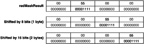
To do a shift in code use the >> operator and the number of bits by which you want to shift. For example:
int redColor = redMaskResult >> 16; // result = 0x00000055
If you take this a little further, you can see that to get the alpha component you would need to shift by 24 bits (3 bytes); likewise, the green would require 8 bits (1 byte). The green component sits at the end so it's already a normalized integer, and you don't need to shift anything. Here's the code to mask and shift out all the components. You'll notice I'm now combining the two steps into one line of code.
int p = rgbDate[i]; // Grab a pixel from the rgb array.
int alpha = ((p & 0xff000000) >> 24);
int red   = ((p & 0x00ff0000) >> 16);
int green = ((p & 0x0000ff00) >> 8);
int blue  = ((p & 0x000000ff) >> 0);
You can now adjust these values as normal integers. If you want to increase the intensity of red in a pixel, you can simply increment the red integer value. To increase the general brightness, you can increase all the values. For example:
// increase brightness of image
red += 25;
green += 25;
blue += 25;
Now comes the last piece of the puzzle: How do you put the colors back into the ARGB format? Thankfully, this is much easier than extracting the values. You simply shift each component back into the correct position and then add them all together. For example:
int newColor = (alpha << 24) + (red << 16) + (green << 8) + blue;
And that's it. You can now extract the alpha and color components from any pixel, play around with the values, and then put them back. To give you an idea of how easy it can be to play around with images, take a look at a more comprehensive example.
In the following code, I load an image of an alien head that is black on one side and red on the other. Using the MIDP 2 RGB image tools, I recolor it to blue and then green. You'll notice in Figure 19.14 that the various shades of each color are maintained throughout the process.
Figure 19.14. You can use RGB image tools to change images. In this example, the red elements of an image are flipped to blue and green.
import javax.microedition.lcdui.*;
import javax.microedition.lcdui.game.Sprite;
import javax.microedition.midlet.*;
import java.io.IOException;

public class RGBImageExample extends MIDlet
{
    private MyCanvas myCanvas;

    class MyCanvas extends Canvas
    {
        private Image redImage = null;
        private int[] blueRGBImage;
        private int[] greenRGBImage;

        public MyCanvas()
        {
            try
    {
        // load up the original red alien head from a resource file
        redImage = Image.createImage("/alienhead.png");

        // create new versions by flipping color bytes around
        blueRGBImage = flipImageColor(redImage, SHIFT_RED_TO_BLUE);
        greenRGBImage = flipImageColor(redImage, SHIFT_RED_TO_GREEN);

    }
    catch (IOException ioe)
    {
        System.out.println("unable to load image");
    }
}

protected void paint(Graphics g)
{
    g.setColor(0, 0, 0);
    g.fillRect(0, 0, getWidth(), getHeight());

    // draw the original
    g.drawImage(redImage, 25, 50, Graphics.TOP | Graphics.LEFT);

    // draw the color-shifted images
    g.drawRGB(blueRGBImage, 0, redImage.getWidth(), 75, 50,
                redImage.getWidth(), redImage.getHeight(), true);
    g.drawRGB(greenRGBImage, 0, redImage.getWidth(), 125, 50,
                redImage.getWidth(), redImage.getHeight(), true);
}

private static final int SHIFT_RED_TO_GREEN = 0;
private static final int SHIFT_RED_TO_BLUE = 1;
private static final int SHIFT_GREEN_TO_BLUE = 2;
private static final int SHIFT_GREEN_TO_RED = 3;
private static final int SHIFT_BLUE_TO_RED = 4;
private static final int SHIFT_BLUE_TO_GREEN = 5;

public int[] flipImageColor(Image source, int shiftType)
{
    // we start by getting the image data into an int array - the number
    // of 32-bit ints is equal to the width multiplied by the height
        int[] rgbData = new int[(source.getWidth() * source.getHeight())];
        source.getRGB(rgbData, 0, source.getWidth(), 0, 0, source.getWidth(),
                        source.getHeight());

        // now go through every pixel and adjust its color
        for (int i=0; i < rgbData.length; i++)
        {
            int p = rgbData[i];

            // split out the different byte components of the pixel by applying
            // a mask so we only get what we need, then shift it to make it
            // a normal number we can play around with
            int a = ((p & 0xff000000) >> 24);
            int r = ((p & 0x00ff0000) >> 16);
            int g = ((p & 0x0000ff00) >> 8);
            int b = ((p & 0x000000ff) >> 0);

            int ba=a, br=r, bb=b, bg=g; // backup copies

            // flip the colors around according to the operation required
            switch(shiftType)
            {
                case SHIFT_RED_TO_GREEN:   g = r; r = bg; break;
                case SHIFT_RED_TO_BLUE:    b = r; r = bb; break;
                case SHIFT_GREEN_TO_BLUE:  g = b; b = bg; break;
                case SHIFT_GREEN_TO_RED:   g = r; r = bg; break;
                case SHIFT_BLUE_TO_RED:    b = r; r = bb; break;
                case SHIFT_BLUE_TO_GREEN:  b = g; g = bb; break;
            }

            // shift all our values back in
            rgbData[i] = (a << 24) + (r << 16) + (g << 8) + b;
        }

        return rgbData;
    }

}

public RGBImageExample()
{
        myCanvas = new MyCanvas();
    }

    protected void startApp() throws MIDletStateChangeException
    {
        Display.getDisplay(this).setCurrent(myCanvas);
    }

    protected void pauseApp()
    {
    }

    protected void destroyApp(boolean unconditional) throws MIDletStateChangeException
    {
    }
}
Other Extras
So far I've only touched on the major new additions to the LCDUI. However, there are a host of other great extras that you'll also find useful. Briefly, these include
Gauge can now use additional styles to indicate progress in different ways, such as the "I'm-doing-something-but-I-can't-tell-how-long-it-will-take-so-just-BACK-OFF-OK" style.
StringItem can use different fonts via a setFont method.
TextField and TextBox have the new input constraint types listed in Table 19.3.
Table 19.3. New Text Input Constraints
Input Constraint Type
Description
SENSITIVE
Implementation cannot store the value internally.
UNEDITABLE
User cannot change contents.
NON_PREDICTIVE
Predictive input disabled.
INITIAL_CAPS_WORDS
Capitalize the first letter of every word.
INITIAL_CAPS_SENTENCE
Capitalize the first letter of every sentence.
DECIMAL
Restrict values to numbers plus a decimal point.
Form has the new methods getHeight, getWidth, and deleteAll. I'll let you guess what they do.
Alerts can now contain Gauges as well as be interrupted using a special dismiss command. You can also set a listener for this event to catch when a user cancels something.
StringItem and ImageItem can now set an appearance mode to PLAIN, HYPERLINK,or BUTTON to change how they look.
For devices that support it, you can now control lights and vibration.
Commands can now have an optional "long" text label, which will be used if space permits.
You can now set up a notifier for you to be called back if the size of the screen changes for any reason (such as changing modes).
You can now set an item to be current as well as a Displayable.
| |